As I’ve mentioned a couple of times over the last few weeks, I’ve been running a competition to see who can create the new Fourth Eye Logo. Entries have now closed and it’s time to vote. All of the submissions have been posted anonymously below, and they’re numbered 1 through 8. You should find a poll in the side-bar of this page (to your right), so find the corresponding number and take your pick. You can also click on each picture for a larger version (where available). Some of them lose a bit of quality in the way WordPress compresses them.
Since this is my site and ultimately I’ll be picking the winner (though I will be swayed by votes) I’m going to publicly nominate number 8 as my favorite, but feel free to disagree with me. Vote like you’re trying to get John Howard out of office!
1.
2.Â
3.
4.
5.
6.
7.
8.

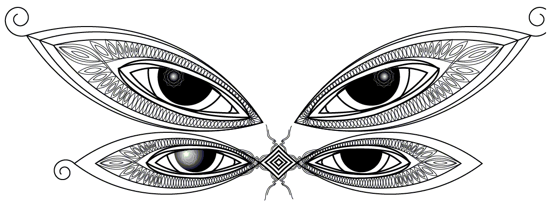
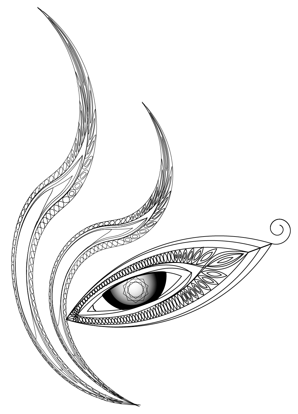


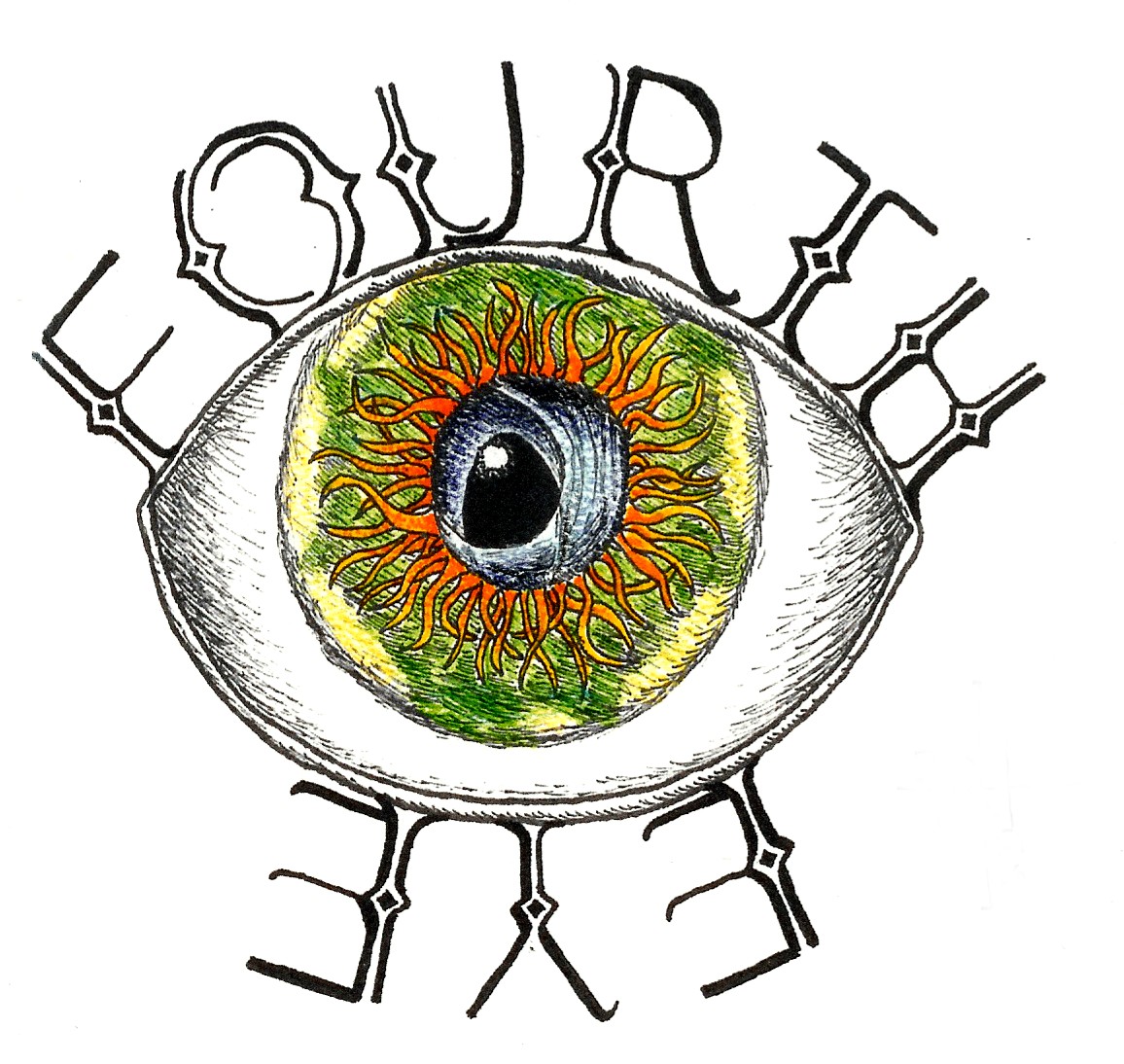
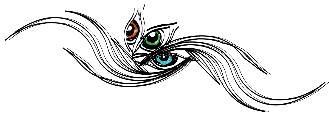
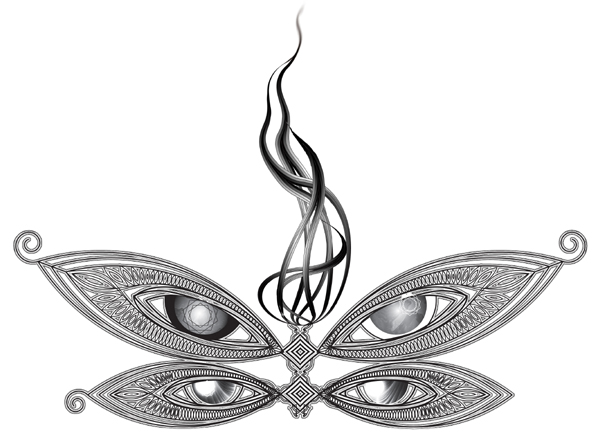
I like number 3 the best, although number 8 is pretty cool.
2, 3, 4 and 8 have to be done by the same artist. I think 8 actually… but I like 7 aswell.
Trying to get John Howard out? Don’t make me vote 13 million times to make sure it happens!
Fuck off!
Howard>You
???? are they the only logos that came in ???? hmmmmm. thought there’d be about 50 submissions 🙁
All the logos look tacky as fuck. This is not an “I want to be like Alex Grey” logo. Get some originality people.
If I had to chose I’d go for 7 for it’s simplicity. No. 8 looks overdone and just screams try hard.
2,4, and 8 were done by the same person. Lame.
I thought they were of exceptional quality. Well done to the people who took the time.
#1 is my favorite. The ones with the 4 eyes are ugly.
By the Way Doors your opinions are great sometimes and sometimes you can be a real wanker. That’s my opinion.
Here’s my suggestion, why don’t you get off your own butt and do better? Or maybe even think of something constructive to add once in a while….
5 and 6 look really cool. the artists behind those two works actually had to draw it out and use their imagination (rather than compiling / mixing elements that they found on google).
besides this. i guess it comes down to… “keeping the fast food kids happy.”
besides this. doe’s anyone here dine at McDonalds?
only if i want to die….
well said mate!
Number 7s got my vote. I hope it’s not by some fuckheadcunt that I hate. Do we get to see who did which afterward?
hmmmm, last time i looked, the kids of today dream of dying all the time…
but i guess we all need to keep the McDonald’s kids happy. they are… after all… our future.
And, btw, some of them are good conceptually, but look like rough copies (not cool.) But, nice work all.
Ehh… number one looks pretty deadly too. I didn’t enlarge it, looked gay small.
Not that number one needs any help… but it has my support as well.
I Like Ike.
yes we get to see them. like a fucking gallery. we need to see them on fucking tv. we’ll get them to upload their photos and we’ll also measure how tight their ass is and how long their penis is. ohhh and if its a girl we’ll shove a thumb where her sun don’t shine and if she’s tight we’ll ask her out.
somebody shoot me before i puke.
do you think think something constructed of 3 images found on google is actually original “art”.
come to think of it, if somebody posted this > http://bioinf.ucsd.edu/~ajoyce/img/lateralus.jpg
i think that would have received 100% of the votes.
1 is the only one that doesn’t suck balls.
hellboy — my vote rests with number 7 although number 8 would be great with a little more symmetry and a little colour. either way no 7 or 8 are the only options. i think no 1 looks to much like a venue plan : ). the obvious resemblence to the tool-army logo also brings no 1 down as i dont think 4theye should be seen like army — it doesnt cost money among other things.
I tried to vote like I was trying to vote out John Howard but it would only allow me one vote… There are too many stupid people out there, how can I change the world with only one vote… oh wait, FourthEye, not Australia, presumably other enlightened beings here, one will do.
8 is cool.
And yeah, I’ll try once more to vote Howard out of office, though I’m not in his electorate.
Man some of you guys are whining bastards…..
Credit will be given to the winner unless they choose to remain anonymous.
I wish we could vote out John Howard obviously, but then I look at the alternatives and get a little dissillusioned……Would anything really change if there were a different Prime Minister? I doubt it…
Number 8 is very intricate. to appreciate its detail, the logo would have to cover up the whole page, and that would be downright nutty. scaled down, images 5 and 7 look great. I dig number 1 conceptually, but like someone suggested, it just looks like three layered google images. So my vote for 5. By the way, had you all seen the footage of 10000 days being played live back in 2002? pretty tight. http://www.youtube.com/watch?v=ZmU3aE38Km0
Even though #1 has received most of the votes so far, it shouldn’t include the Toolarmy logo. I think Fourtheye’s logo should be ‘fresh’ and not borrow too much from other logos. Add a little bit of colour to #8 and Bob’s your uncle…
http://www.youtube.com/watch?v=WbeHFzDmi8c&mode=related&search= …..better
http://www.youtube.com/watch?v=WbeHFzDmi8c mab better link?…
Heres some crap-efforted shirt oulines of the top three. Think hard about which one you’d rather wear!
1. http://i59.photobucket.com/albums/g303/dickbarf/T-ShirtOutline211.jpg
7.
http://i59.photobucket.com/albums/g303/dickbarf/T-ShirtOutline2.jpg
8.
http://i59.photobucket.com/albums/g303/dickbarf/T-ShirtOutline21.jpg
And, btw, I agree that #1 takes way too much from… others. It looks good, but, the former does play a big part.
i am agreeing with a few comments particularly about seeing the intracacy of some of the designs as an actual small page logo.
also would the shirt design (happening still?) be just the design or the words ‘fourth eye’as well?
i must ponder on this
Heh,the important part of my link was its date- 2002. Some four years BEFORE the songs official release…
Yes, but the actual song was played not just a saved riff…….
Based on your shirt designs Panoply, I think 7 goes best. Maybe 8 would be alright if it were moved up a little… I’m not much of a fan of 1, it looks cool, but my bias for more originality doesn’t look like going away any time soon.
I wouldn’t call ’em designs… just what they would look like on something shirt-shaped. And I share your same feelings of #1.
8 is nice… but it’s a bit much. I thought I would put it on the lower back so it would kind of resemble someone’s back tatt… we could grow the flame thats coming from the top; make it even more intricate–it would work for a shirt.
…I was a little disappointed that every logo had at least one eye. Eyes are so overdone.
hmmmm
http://www.platform24.net/fourtheye.htm
when i designed these i didn’t put much thought into the “logo” aspect. but looking at them now i think 7 could fit in the the “logo” catagory. took about 30 minutes to create in illustrator.
8 was more inspired by tool / alex grey. just artwork that could be printed in high quality for sticking on my pc or guitar. which image get’s selected i’d love to see 7 or 8 on a tee. or a tanktop! perhaps i’ll do this myself and upload it for those who wish to see.
I like 7 blown up and closed in like that.
you do honey? well you should know that i’d like to close in on you and blow you… {‘;’} sorry couldnt resist the play on words… it’s not everyday you can be this witty without looking like a tool. the images are made in black and white so they can “evolve” over time into something close to “original” and ultimately “beautiful”. i forgot to tell hellboy when i sent them to him that # 2 and # 4 were just drafts. anyway before i do get them printed. i’ll whack all the logos (1-8) on a t- and a tanktop… Read more »
Sorry Panoply… I was assuming I was looking at the front on all of them, my mistake. That does make sense for 8 on the back.
Not everyday is not necessarily today Jonas. Kudos to you though, for doing the awesome logo’s… Look forward to seeing how they look on fabric.
tank tops. i’ll eventually get the top 3 logos in there.
http://www.platform24.net/fourtheye2.htm
I think the bigger one looks better… is a reason to stare really needed?
oh sure it does. beautiful breasts make the world go round. literally speaking. 😆
Yeah, I too like the bigger one. Looks great on a shirt, especially a wrap around. We can definitely do more with something like 7 and 8, rather than 1.
definetly no 1 is shit. anyone have a sneaking suspicion that no 1 was just voted for over and over through anon proxies???
hmmm well in my honest but polite opinion. #1 isn’t shit. it’s just not original. but more importantly it’s bitmapped graphics which means its not designed for printing purposes. if you enlarge it just by stretching it out it loses quality dramatically. something they teach you in design school very early on.
more tank tops.
http://www.platform24.net/fourtheye2.htm
i never thought i would complement you mr lindgren but no 2 (the t-shirt designs) is quite good. what is your job?? all your designs are excellent and i dont know why they havent won as no 1 is quite dissapointing
i’m glad you like them. since you ask, im actually a network engineer but i also do freelance graphics design. i’ve done some freelance work for the aus museum here in NSW. the govt pays pretty good. but those kinds of jobs aren’t consistent and don’t last too long, a month or two at most.
Well done Jonas_Lindgren! In my opinion, your designs kick arse! Numbers 7 and 8 look really good in those photos you have posted above. I said a few days ago that if you added a little colour to #8 we would have a certain winner. Number 7 looks great with colour too but I still prefer 8 for some reason… maybe we Fourtheye can use both? Kudos to you. Yeah I too am suspicious of #1. It has received a lot of votes so far which disappoints me as it features the Toolarmy design etc. Fourtheye’s logo should be slightly… Read more »
That’s an excellent point Mattw. I agree that the signature should be completely removed from Toolarmy associations. That’s quite lame.
I selected number 8 because of the originality and relevance. The only criticism I have is that a splash of colour would be great.